
This project focused on packaging design, with the main requirement being a folded container that could be printed, assembled, or digitally mocked up. The product could be real or imaginary, and the design had to be built using a die-cut template. The goal was to explore brand identity, layout, and production-ready packaging—all within the constraints of traditional print design.
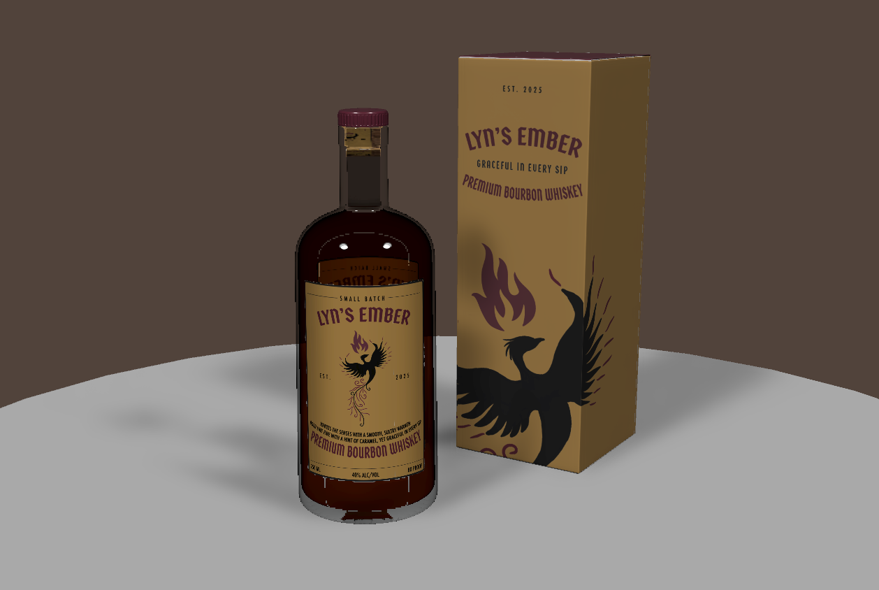
I created Lyn's Ember, a fictional bourbon whiskey brand designed for women who also enjoy whiskey that is smooth, bold, and easy to sip. The brand was inspired by the idea of inner strength and warmth which in symbolized through a phoenix—representing power, grace, and renewal.
I began with developing ideas to define the visual direction of the brand. From there, I created the design elements and laid everything out using a die-cut template in Adobe Illustrator. I focused on clean structure, rich colors, and minimal typography to keep the design sharp and intentional. To bring it all together, I used Adobe Dimension to create a digital mockup that showcases the package design.
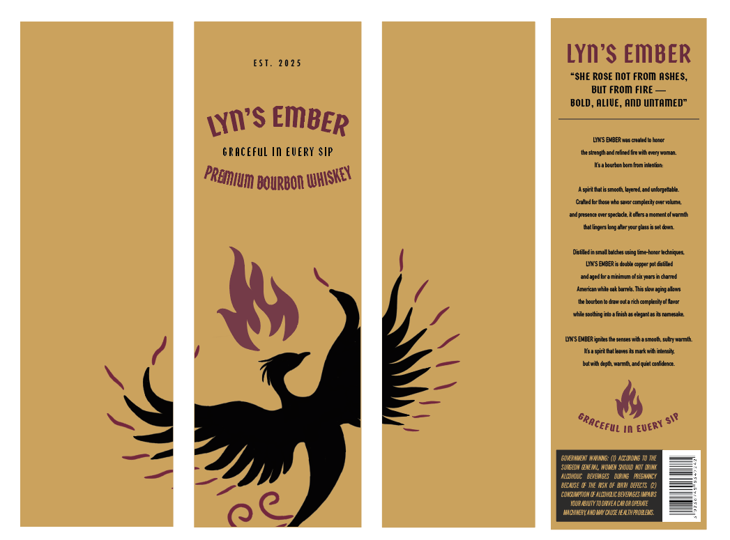
All four sides of box package design lined up together
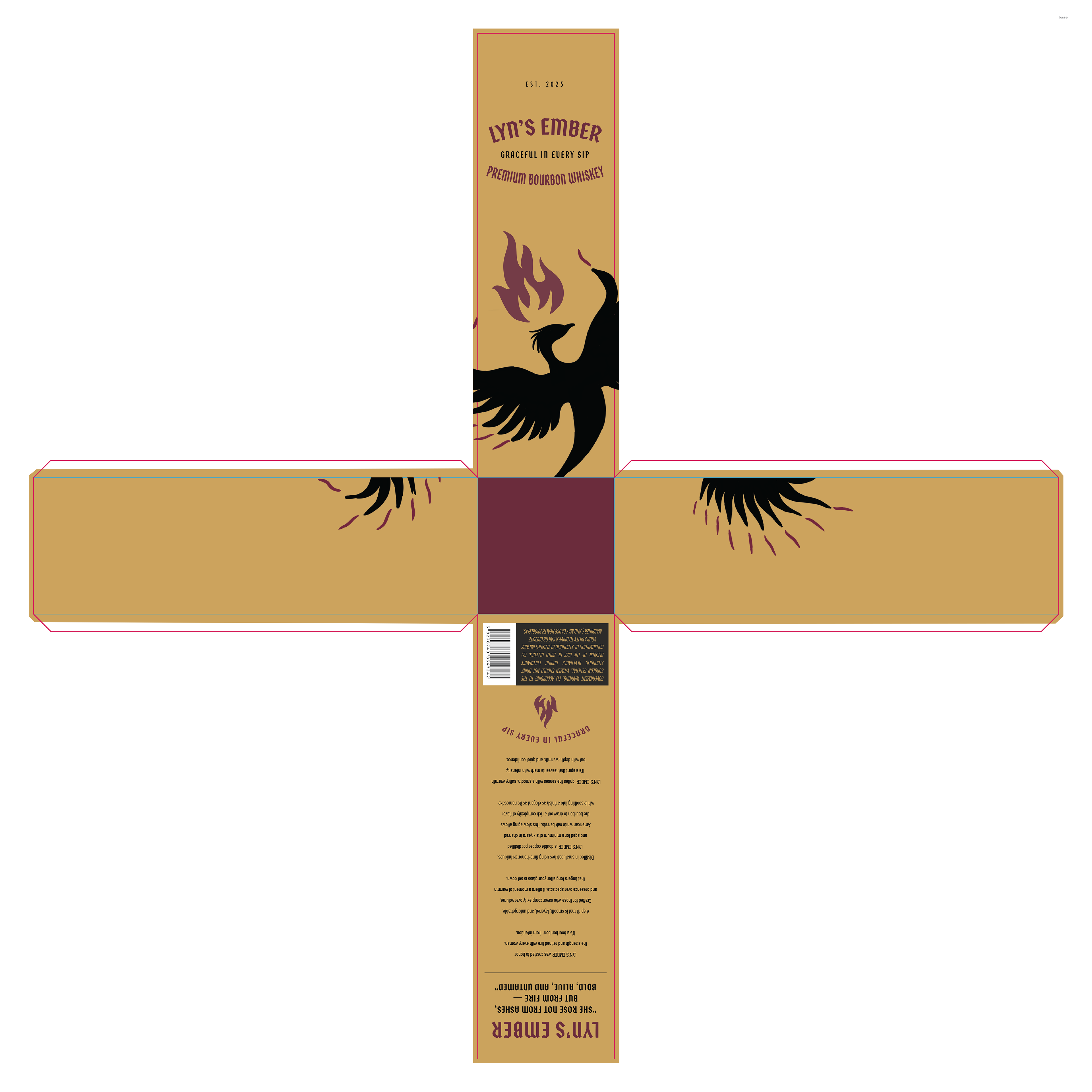
Box package design placed on template with die-cuts
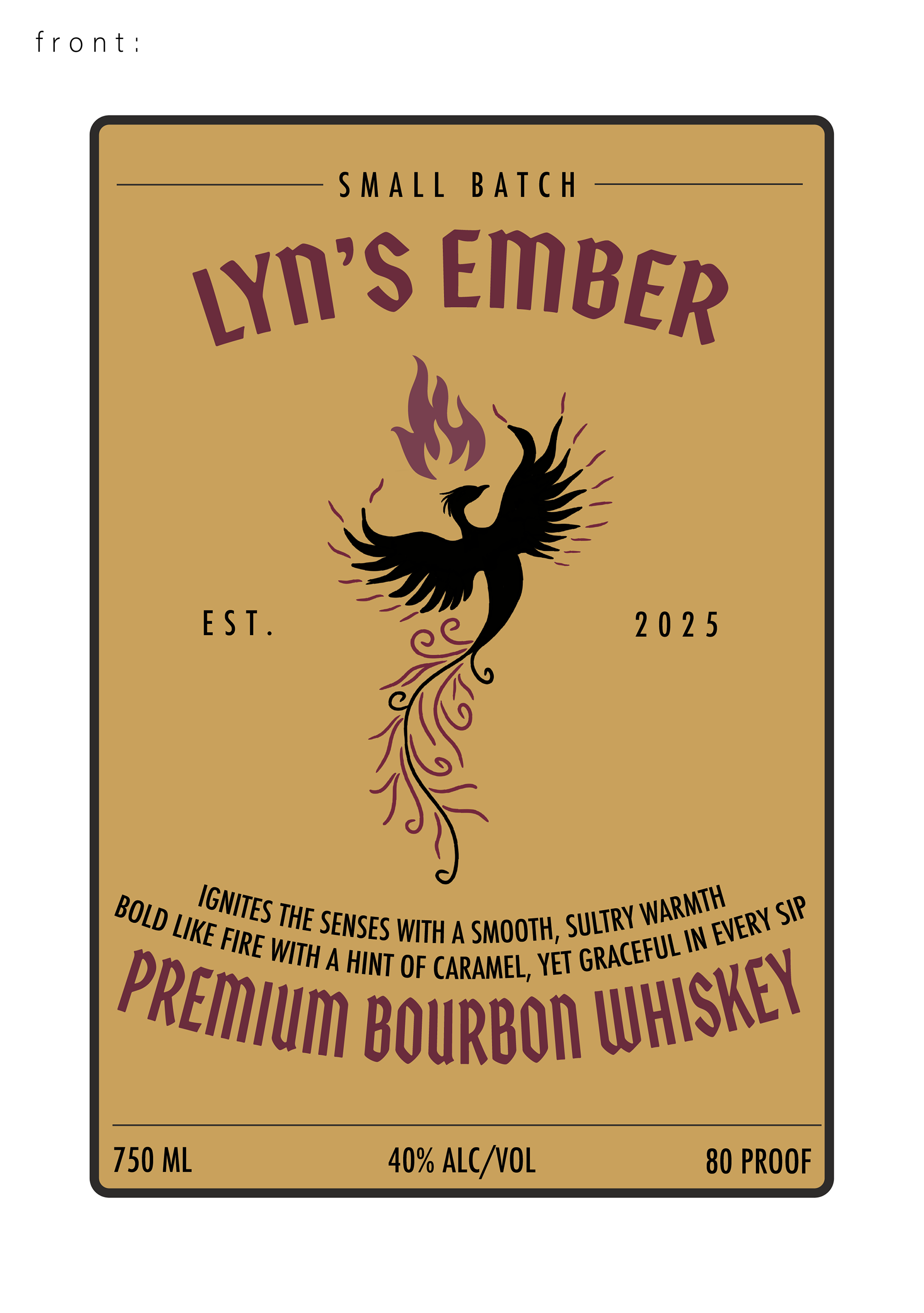
Front Label Design for Bottle
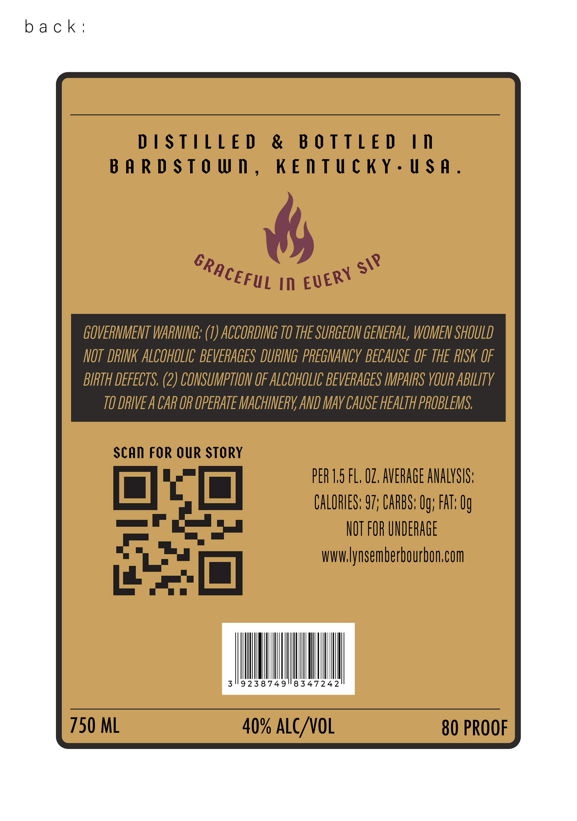
Back Label Design for Bottle
The final design features a folded box with an ember-inspired color palette, a stylized phoenix logo, and a whiskey label that reflects the brand’s message. The design is minimal but meaningful—aimed at making Lyn’s Ember feel as smooth and striking as the drink itself.