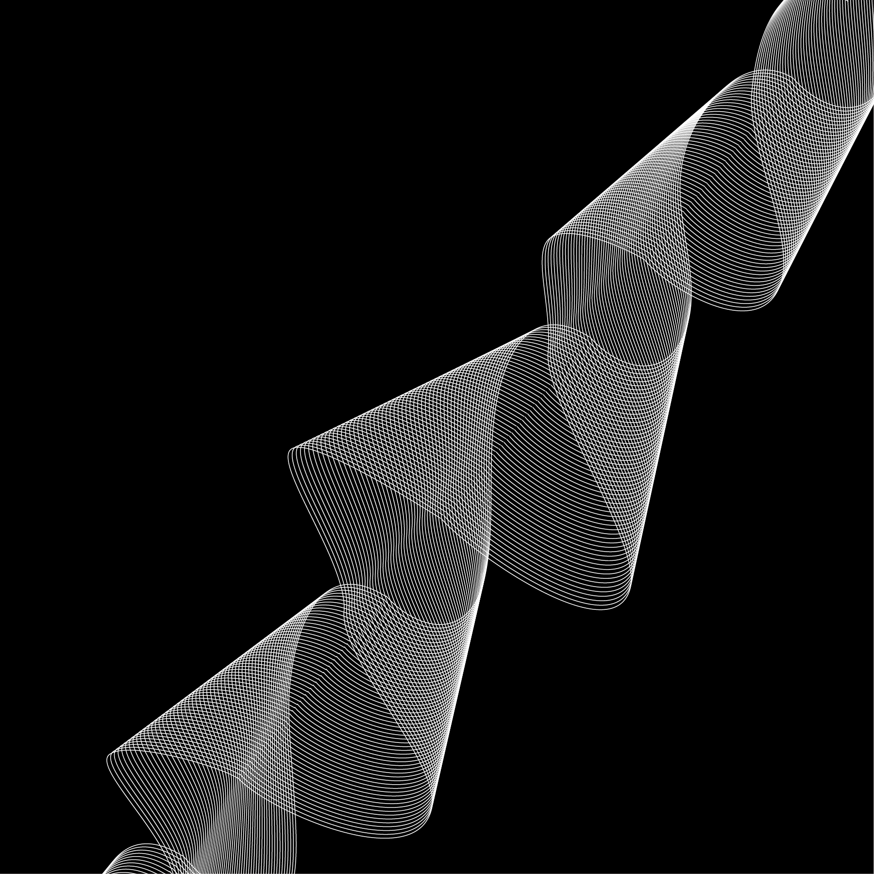
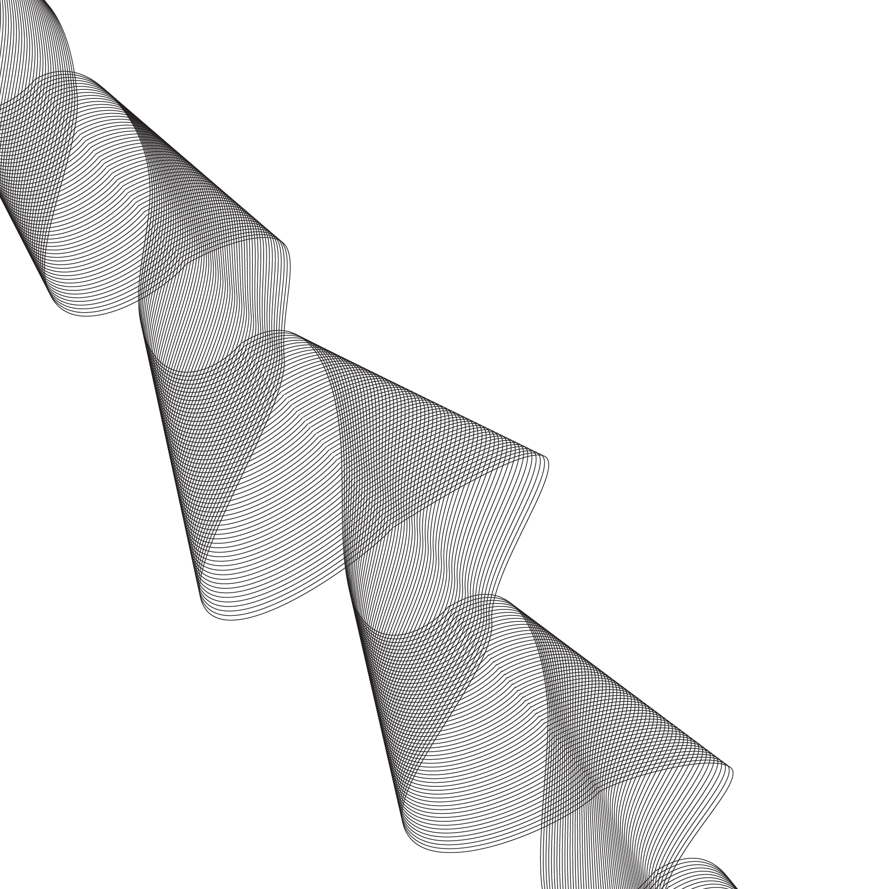
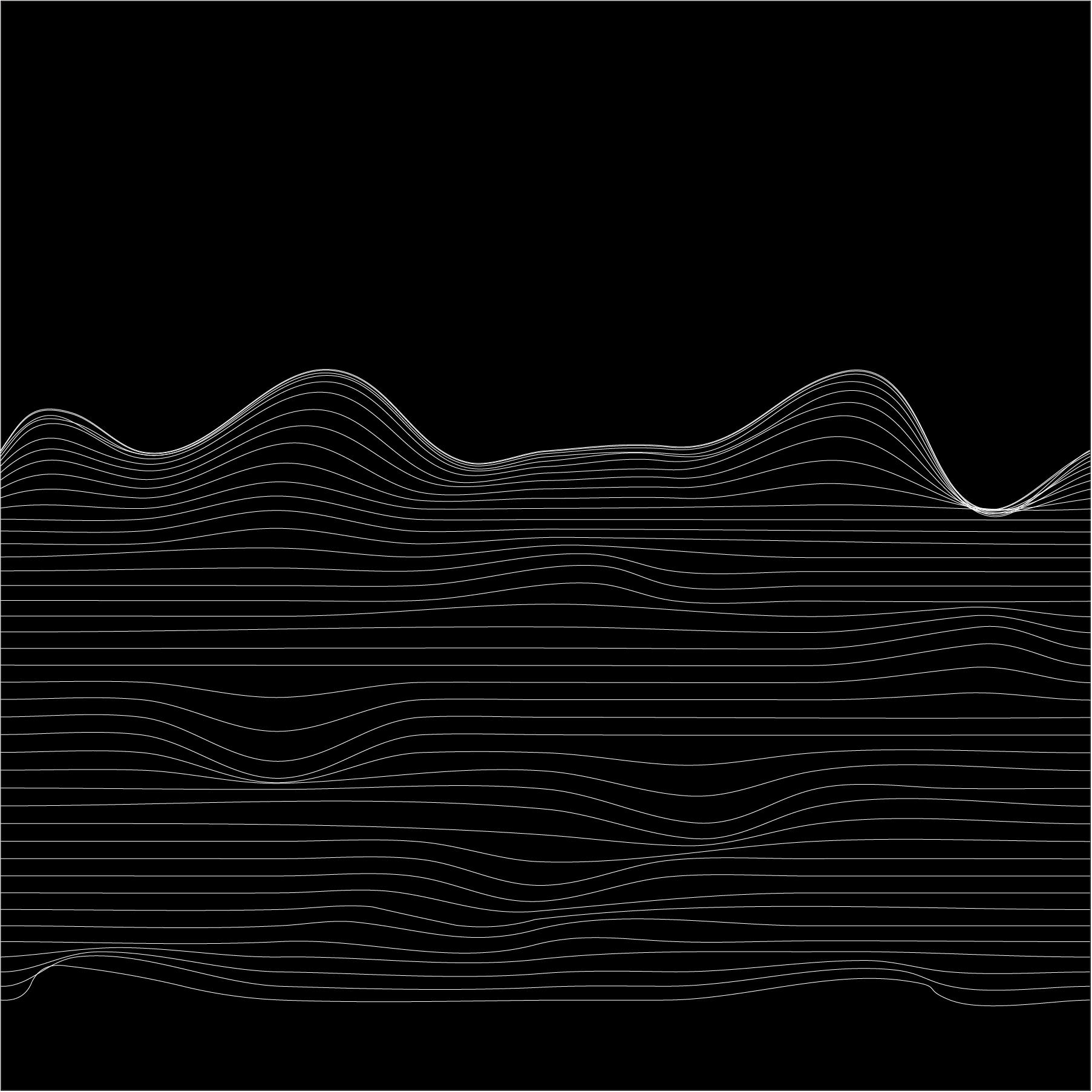
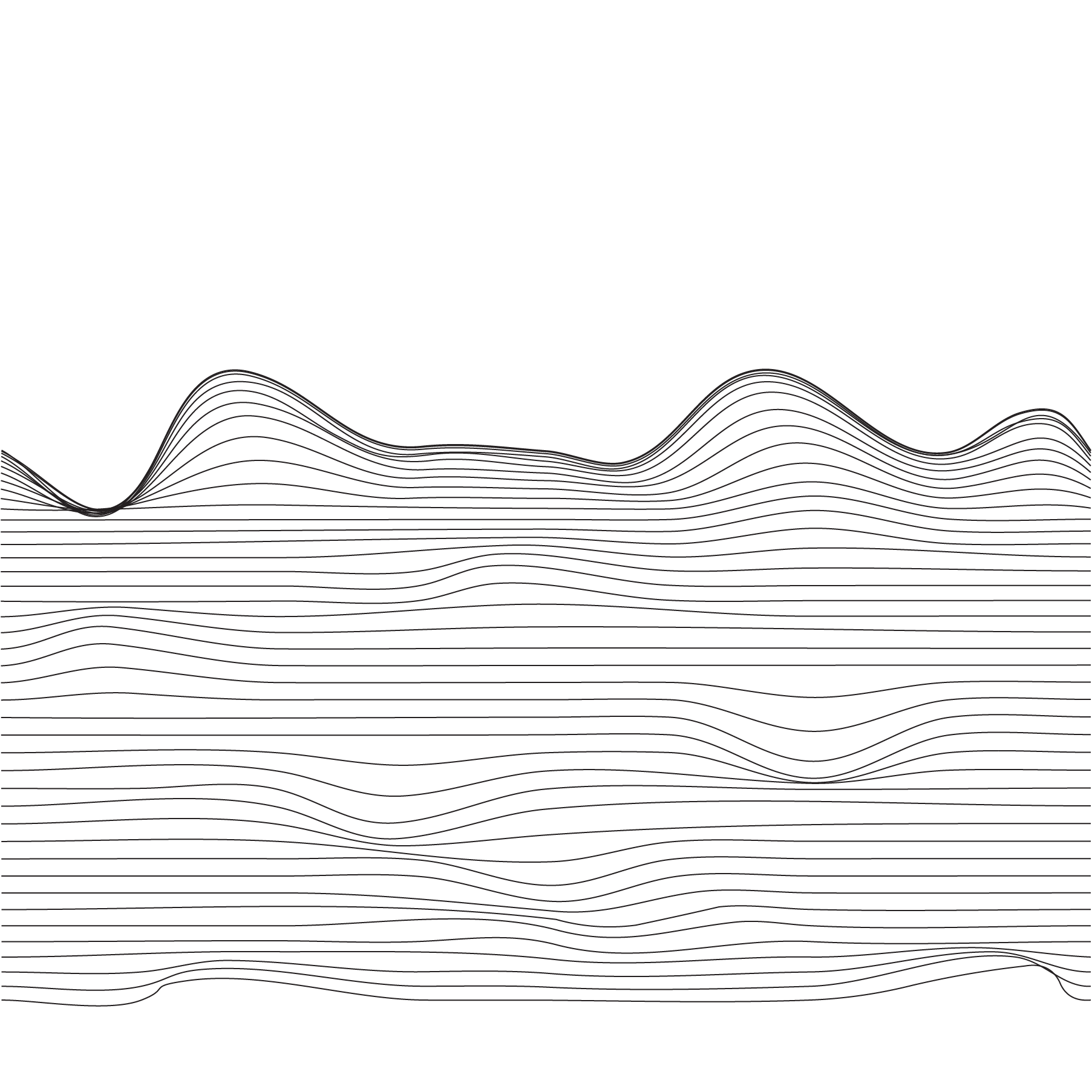
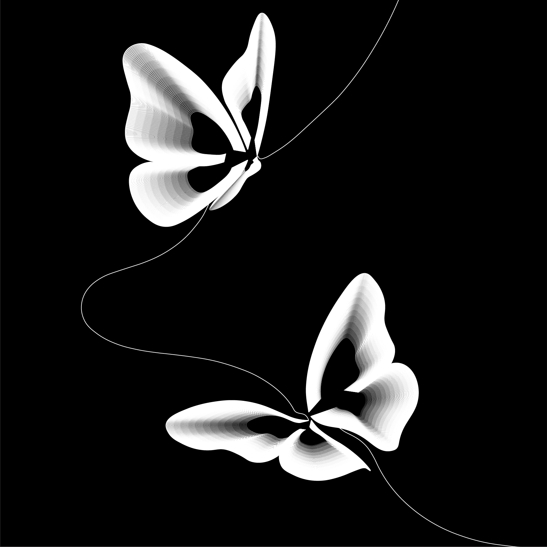
This project focused on gradation—the visual effect of gradual change through repetition.
Gradation is all about progression in form, scale, or spacing. The idea was to create a composition where each unit subtly evolves, row by row or column by column, while still working together as a cohesive whole.
Working strictly in black and white pushed me to think critically about contrast, balance, and visual rhythm. I experimented with variations in shape size, line weight, and layout, paying close attention to positive and negative space, and how cropping could enhance movement and tension in the design.
